A new design language for an industry leader.
Re-imagining the digital design language alongside a global vehicle refresh.
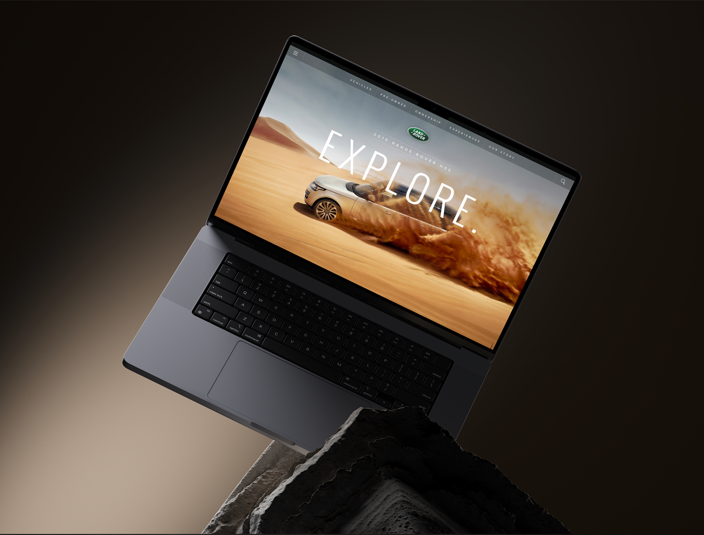
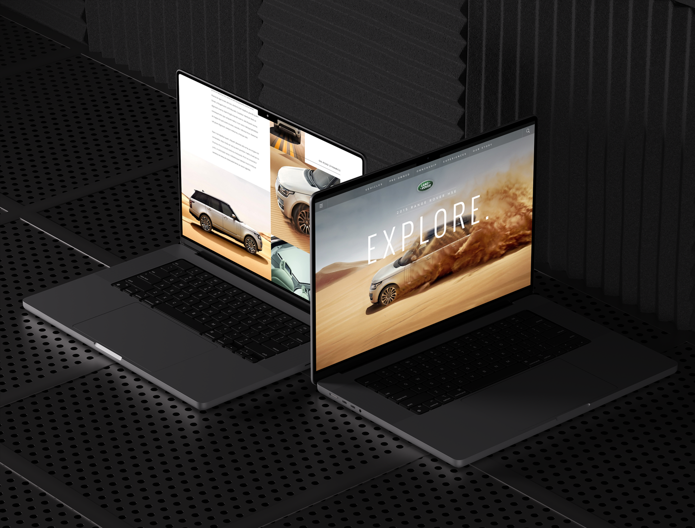
When Land Rover introduced a complete refresh of their model lineup, the design language of their communication platforms needed to evolve alongside. This represented a step change for the business, in going more upmarket with the Range Rover brand, and starting to lay the foundations for re-introducing their more heritage Defender model. The resulting brief asked us to help create a more sophisticated and flexible design system, highlighing the vehicles in new ways, creating consistent interactions and modern navigation frameworks and introducing deeper and more editorial storytelling. Our designs were well received and extended across global platforms and continue to help drive design decisions and reference for the ever-evolving Land Rover brand.
- UX & Interaction Design
- UI Design
- Photography & Copywriting
Our design system, aesthetic and interaction framework providing curated options and a structured rulebook on how deeper and more editorial storytelling could co-exist along vehicle features and sales-focused pathways.
Configurators and vehicle-exploration tools were added alongside stories, ensuring that the dots were connected across heritage, performance, and design and engineering - all of which naturally led to purchase paths or a followup visit to local dealerships.


Beauty through simplicity. Let the vehicles sell themselves.
Alongside the client, we collectively felt strongly that the heritage, performance and quality of the vehicles spoke for themselves - that an oversell of the brand would cheapen it. Our designs reflected this confidence and celebrated the performance, adventure and 'Go Beyond' nature that both avid hardcore Land Rover fans would appreciate, and new-to-brand buyers would get excited by.


